This week the studio fell down a rabbit hole on dialed.gg, and we are not quite the same people we were on Monday.
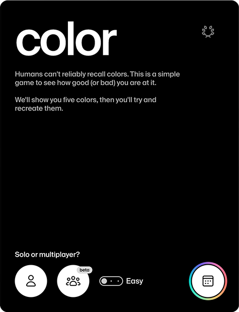
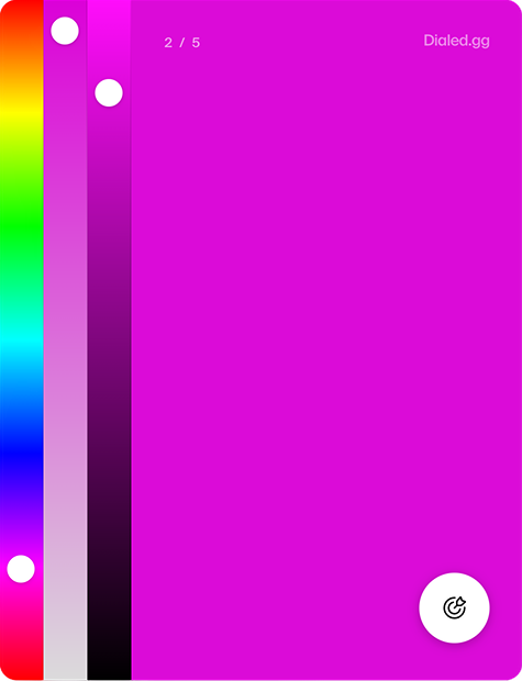
The premise is almost insultingly simple. It shows you a colour for a few seconds, the colour vanishes, and you rebuild it from memory using three sliders: hue, saturation and brightness. Do that five times, get a score out of fifty. That is the whole game.
We are a branding studio. We stare at colour for a living. We assumed we would be excellent at this. We were not.
What made us feel better
It turns out people are genuinely terrible at recalling colour, and there’s science behind it. When you look at a colour, your first vivid impression of it lasts a fraction of a second before it drops into working memory, which can only hold a few colours at once and starts losing precision almost immediately. By the time the swatch disappears, your brain has already started quietly editing it.
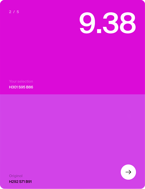
Hue is the part you cling to. You will remember that something was blue. What you will not remember is exactly how blue, how vivid it was, or how light or dark, and that is where your score quietly bleeds out. Saturation is the silent killer. And dialed.gg is not just a toy. It scores you using Delta E in the CIELAB colour space, the same perceptual maths used in professional colour calibration. So when it tells you that you missed, it really means it.
Why a branding studio cares
Here is why this matters beyond five minutes of well-earned ego death.
If even trained eyes cannot recall an exact hue from memory, then no customer is ever holding your precise brand colour in their head either. Nobody is walking around with your hex code memorised. They never were.
So brand colour was never about recall. It is about recognition.
Nobody remembers Cadbury’s exact purple or Tiffany’s exact blue. They recognise it the instant they see it, in the right context, because the brand has used it relentlessly and consistently for years, until the colour and the brand became the same thing. The colour does the remembering for you.
That is the actual game. Not “will people remember our colour” but “will they recognise it, everywhere, every time.” Which is exactly why we are so annoying about colour consistency across every single touchpoint: the website, the packaging, the signage, the social grid, the email footer everyone forgets about.
It's not just colour
Once the colour game has finished humbling you, you notice there’s a whole row of these things along the top of the site, each one quietly torturing a different sense.
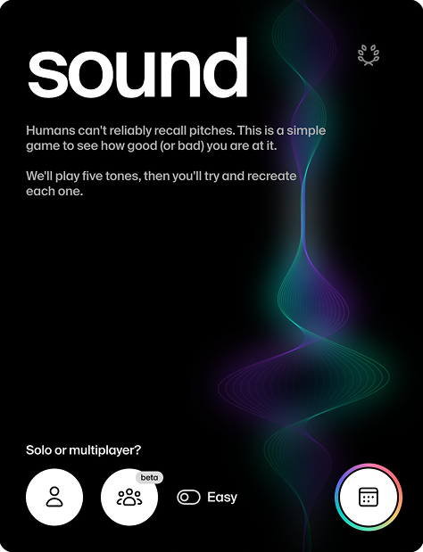
Sound, for the audio people.
dialed.gg/sound plays you five pure tones, then asks you to drag a slider to recreate each frequency from memory. No piano, no reference note, just your ears. It even scores you on a psychoacoustic scale (ERB) rather than raw Hz, so it grades the way humans actually hear rather than how a tuner does. If you do sound design, music or any kind of audio production, this is the one that’ll keep you up at night. Headphones on, quiet room, prepare to be disappointed.
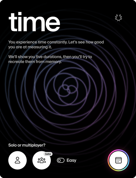
Time, for the motion crew.
dialed.gg/time shows you five durations and asks you to recreate them from memory by pressing and holding. No countdown, no clock, just your internal sense of timing. Which, it turns out, is a liar. Anyone who animates, edits video or obsesses over the timing of a transition will recognise the exact feeling of being certain something is two seconds when it’s actually four.
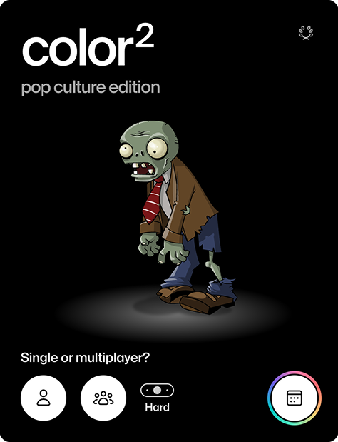
Colour², for pop culture nerds.
dialed.gg/color2 shows you famous characters and logos with one colour deliberately wrong, and asks you to fix it from memory. It’s the entire point of this blog turned into a game: you’ve seen these brands ten thousand times and you still can’t dial the colour back to where it should be.
Go embarrass yourself
Honestly, just play it. Then send it to your most confident colleague and watch them come apart in real time.
Our studio high score is 46 and we would genuinely like to defend it.