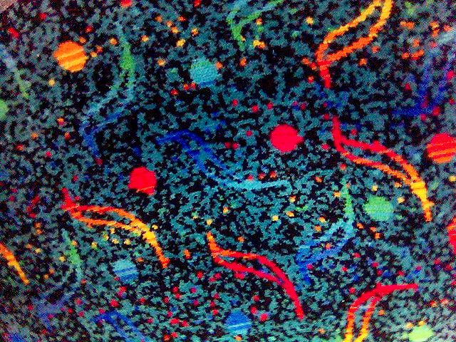
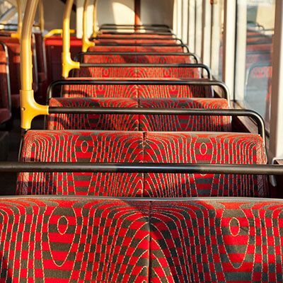
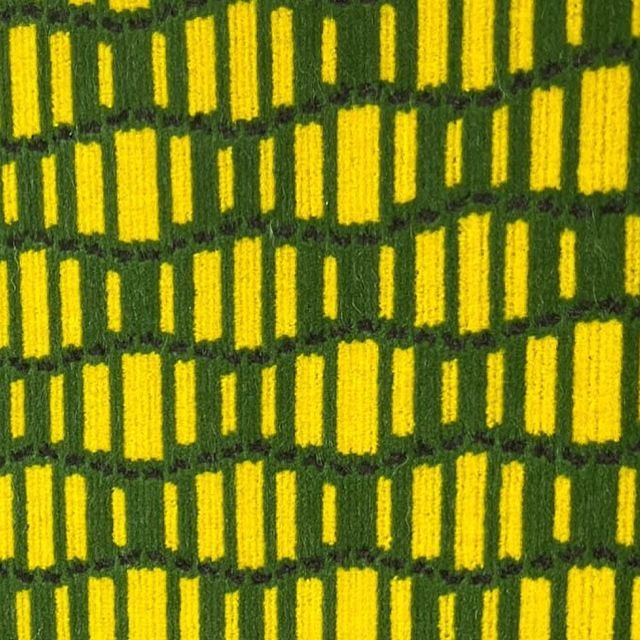
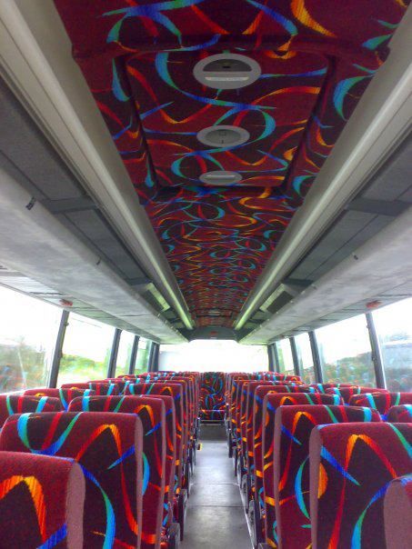
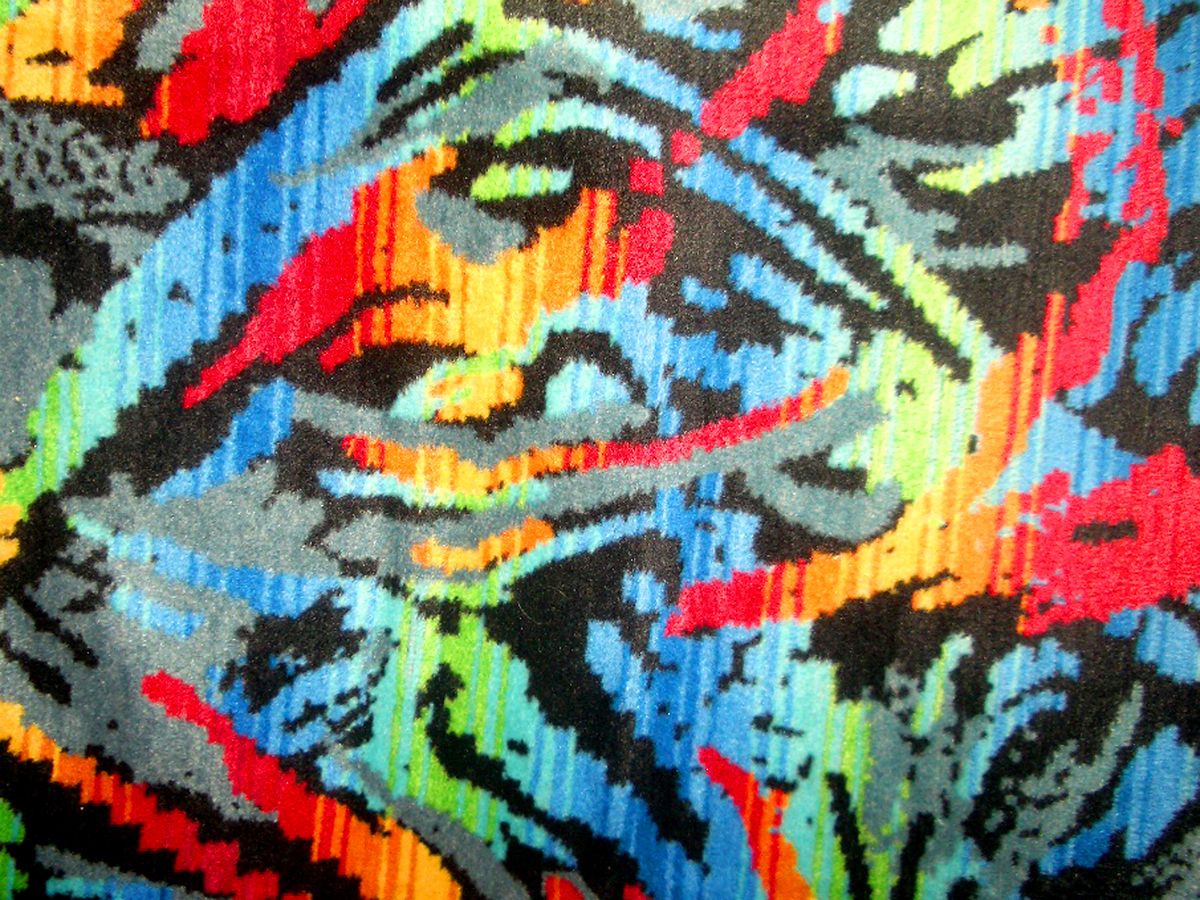
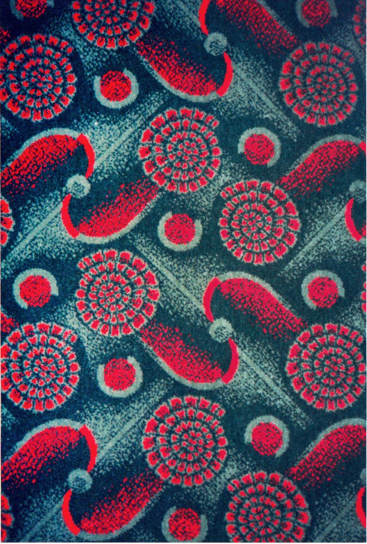
If you’ve ever taken a ride on an old bus, the chances are it had some wild, clashing seat fabrics that look like they were designed during an LSD trip. Turns out, there’s a reason for it. These patterns aren’t just random chaos – they’re carefully designed to conceal dirt, stains, and years of wear from thousands of commuters.
What fascinates us is how unapologetically bold they are. No muted palettes here, just neon swirls, abstract geometrics, and colour clashes you’d never get away with in a brand guidelines doc. They’re practical, yes, but they’ve also become an unintentional design genre of their own.
So, here’s a gallery of our favourite bus seat patterns – the good, the bad, and the gloriously ugly.
Do you need help with design or branding?
We design identities and visual systems that make businesses easier to choose, easier to trust and ready to grow.


