Ilkley Brewery is an award-winning Yorkshire brewery with a loyal following and a reputation for quality, straight-talking beer. As the business continued to grow, the brand they had in place no longer reflected who they were or where they were heading. They needed an identity that felt clearer, bolder and ready for the next phase.
Brand Direction
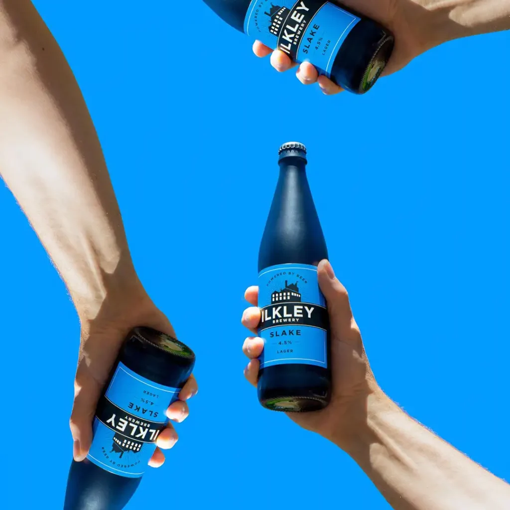
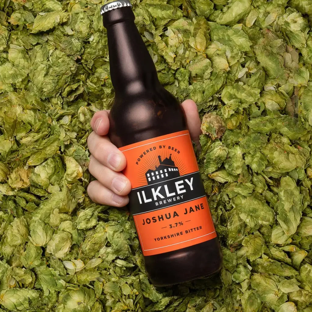
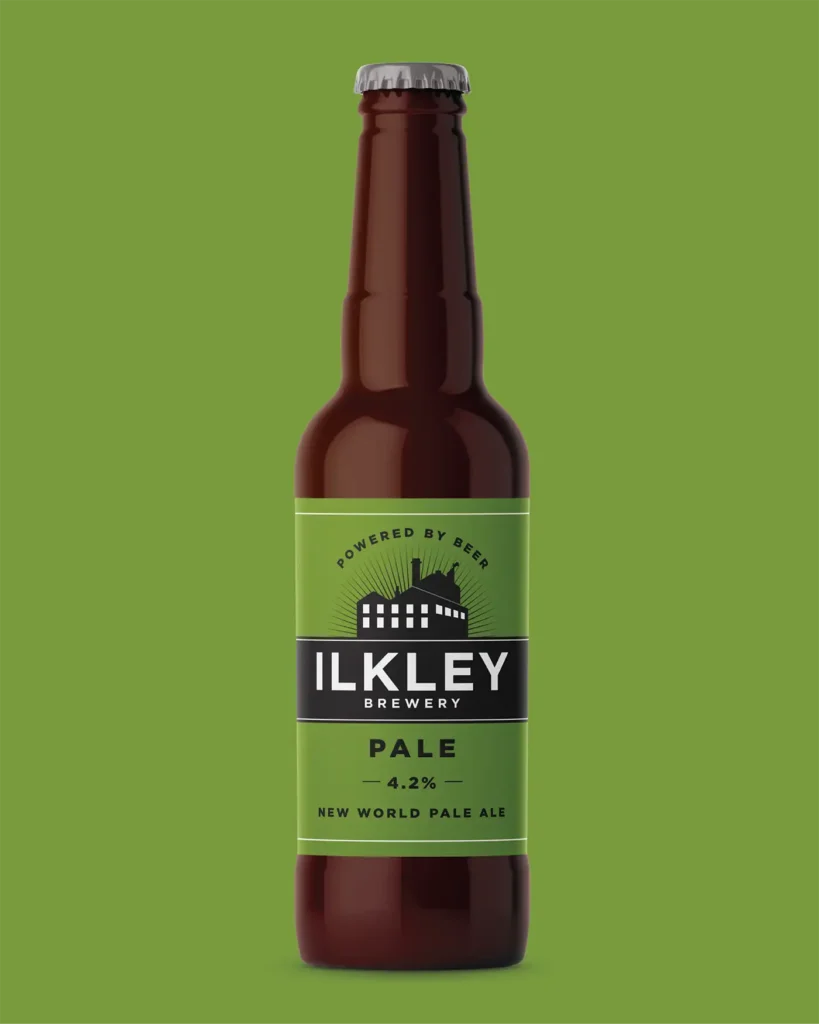
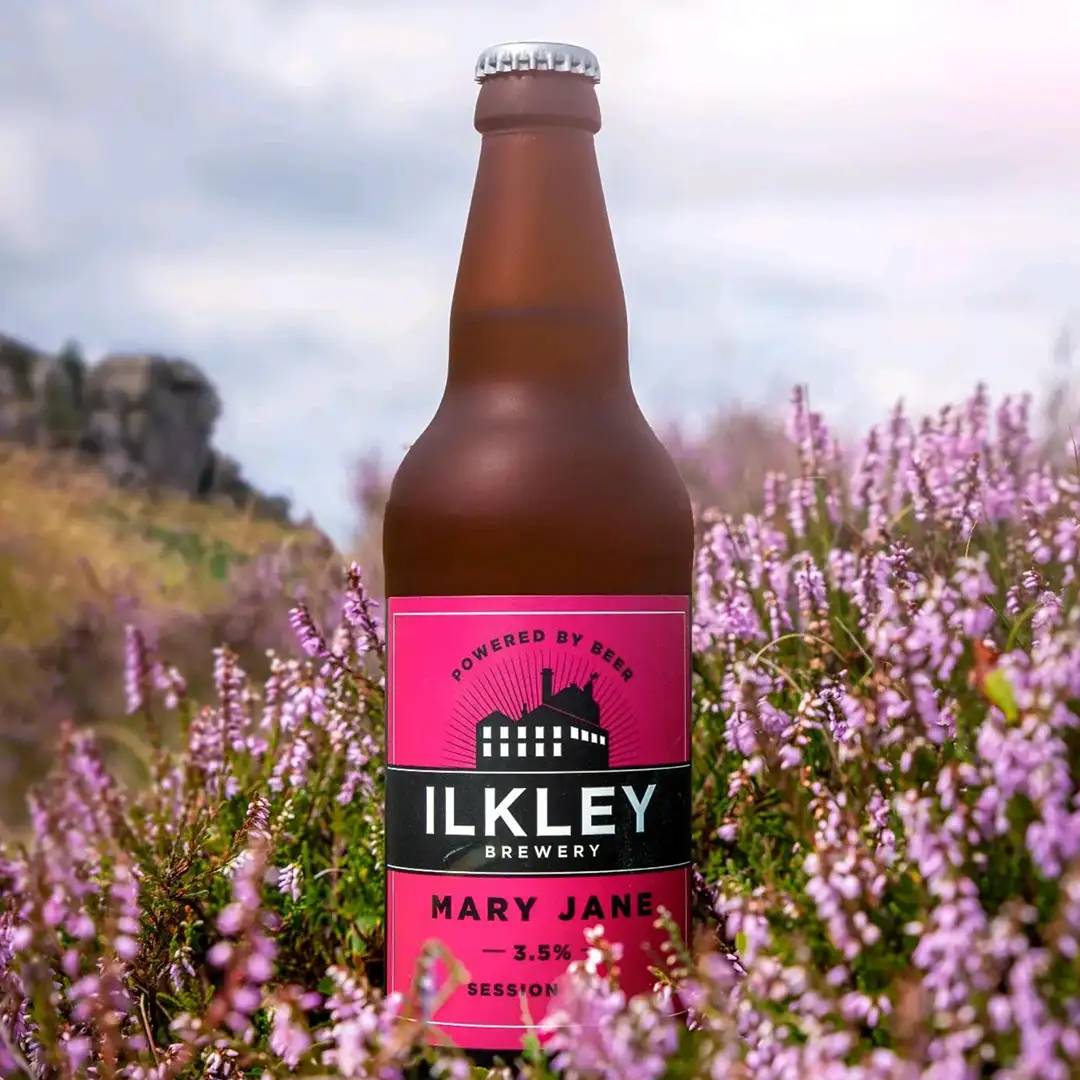
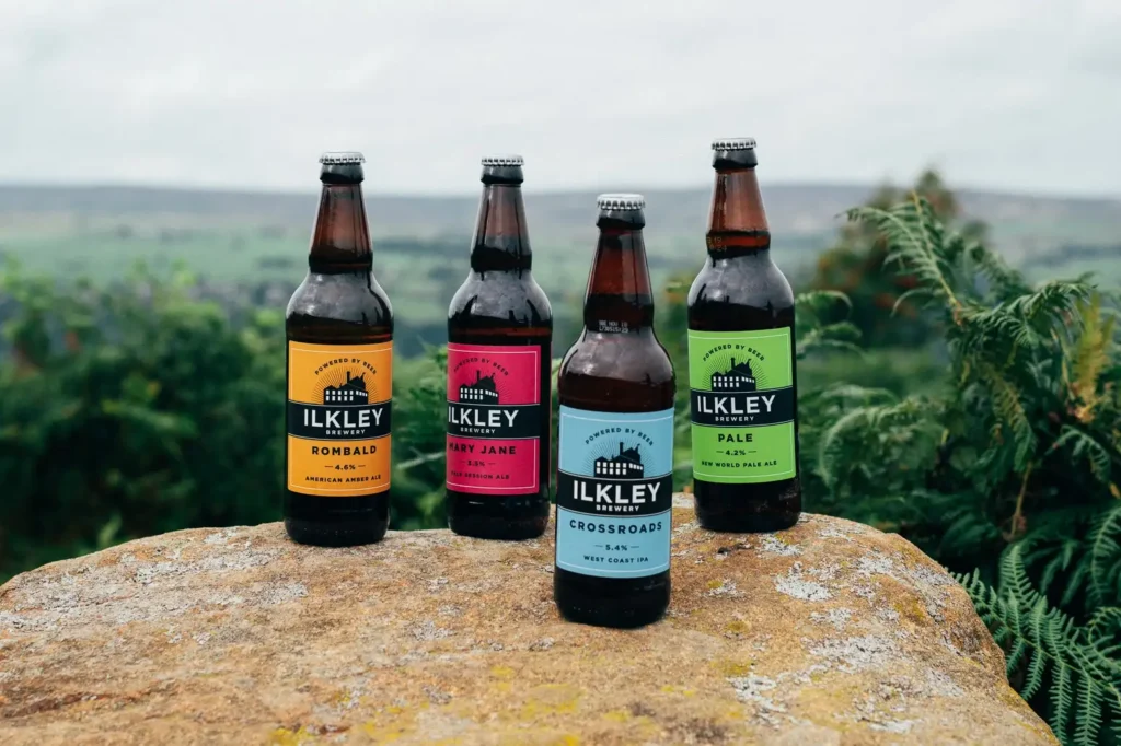
We created a stripped-back identity built around their “Powered by Beer” strapline. It focuses on bold typography, clean layouts and strong colour, giving the brewery a look that feels modern, confident and instantly recognisable. The aim was simple: keep the character, lose the clutter and let the beer lead.
Packaging & Visual System
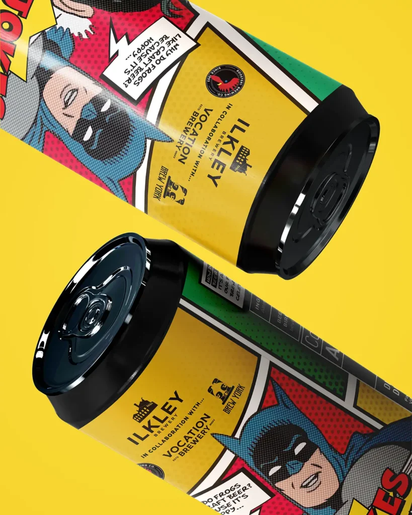
The new visual system keeps things consistent across cans, pump clips and point-of-sale materials. Every element works together without feeling over-designed, giving Ilkley Brewery a cleaner, more cohesive presence both on shelves and behind the bar.
Marketing & Rollout
We continue to support the brewery with marketing assets and social-ready graphics that keep the brand consistent as they grow. The refreshed identity gives the team a flexible system they can use every day, whether they’re launching new beers, promoting events or building their reach.
Results
The rebrand gives Ilkley Brewery a stronger foundation as they continue to expand, helping them stand out in a crowded market while staying true to their roots. The response from trade partners and customers has been positive, with the updated look giving the brewery the confidence and presence their beer already deserved.